Download our E-BOOK
5 Tips When Designing Mobile Apps for Kids
August 12, 2015
by Dan Katcher
Designing apps specifically for children takes both ethics and a different approach than designing for adults. Here are 5 tips that will help you develop your next mobile app for children.
1. COPPA Compliance is Very Important!
The Children’s Online Privacy Protection Act, or COPPA, is a set of guidelines you need to know so you can design your app appropriately. Violating COPPA requirements can lead to million dollar fines, and that’s a good thing. Nothing is more important than protecting the privacy of children in any regard. Rules include obtaining verifiable parental consent prior to collection of personal information of children, restricting the amount of time you can retain personal information, and more. It can get complicated so if you’re unwilling to read every word of the requirements, hire a lawyer who will.
Make sure you’re above board with COPPA. As parents get more savvy about what they download and what information is shared, your app won’t succeed if there is anything opaque about what data is captured and why.
2. Design a Super Clear UX.
Designing a good UX for adults often involve putting in bumper lanes and holding their hand: you want to make navigating your app very clear with little room for error. When it comes to designing an app for children, you basically have to triple these efforts. Remember, kids between 3 and 5 years old have less developed motor skills, so you want to rely on big visuals and a larger hit detection area for actions, as well as limiting the available actions on screen. A great piece of research by Dubit & the University of Sheffield shows what gestures and actions a child (ages 0 to 5) can do on a tablet:
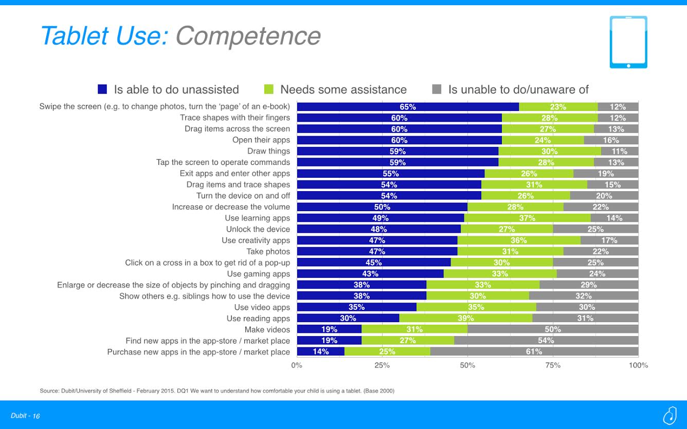
Swiping is easy, pinching and dragging is not. Drawing is easy, clicking on an X to close something isn’t. Research like this can inform your UX, so do your homework before you start designing. Pro Tip: when in doubt, affordance affordance affordance.
As an example, Disney Animated is a great app that lets children interactively explore the history of Disney animation. They did a really great job with the UX of this app, making it easy for a young child to touch into what he or she wants to see, with very little room for erroneous gestures to take them out of the experience. It’s a great example of designing a UX for children, so check it out if you get a chance.
3. Childproof and Walletproof, or else!
You’ve all read horror stories of children spending thousands of dollars on in-app purchases. Now, how much of this is the kid’s fault, the parents’ fault, and the app developer’s fault? Well kids are kids. They want something fun, they go after it. A five year old doesn’t really grasp the concept of money. The parents, sure they’re in charge, but they shouldn’t have to worry about their child accidentally spending money. App developers should be ethical and understand that a child shouldn’t be able to purchase anything without the consent of the parent. And if it’s too easy to circumvent, you can bet that’s some shady app design. A post on smashingmazagine.comhas a great example of this bad practice:

This seems way too easy for a child to click and spend gold coins, and indeed it is designed that way. The key here is that to spend actual money, say $1 = 100 gold coins, there should be a password system in place to prevent any accidental purchases. Perhaps, even prompt to rotate the password every month or so since kids are crafty. It might bother the parents, sure, but better that then to be deleted outright for losing their trust.
4. Design for Impatience.

Don’t worry, there’s no image loading above (weirdly infuriating, right?). Most adults see this little guy and know that hitting the screen a second time won’t help the situation. Kids, on the other hand, haven’t been beaten down by slow internet speeds and other sad realities of the world just yet. It’s possible, and likely, that they will tap the screen over and over again when things don’t happen. A good app designed for children need to take into consideration their impatience.
Repeated taps, overuse of the back button, accidentally closing the app; there are usage considerations that spring up when designing for children that are unique from adults. The worst thing an app can do when used “improperly” is crash or close. Thus, the design has to allow for a whole swath of “user error” and be able to take it in stride. For example, having part of a screen load while another part is active (ie touchable) is a bad idea. Make sure the entire screen is dedicated to loading and all touch is disabled. Keep to one action at a time for best results.
When we designed an app to help children with autism, KidConnect, designing for impatience was a key part of the process. Not only are the icons big and the visuals easy to understand, menus were hidden to minimize accidental touches and navigation was streamlined and simplified to help children easily follow the program on the tablets.
5. Give Them a Breather Every Couple Hours
Finally, let’s get back to what we opened with: the time-on-screen for children. We at Rocket Farm love apps. Of course we do! But we always want to encourage kids to get offline and play. Not only does this help rest their eyes, but allow for interactions with the physical world which is turning into a precious commodity in our increasingly digital reality. Taiwan made it illegal to give kids too much screen time, for goodness sakes. It’s a real problem.
Your app should, at the very least, prompt every couple hours to take a break. Even better, build in settings for the parents to set a timer for when the app will stop working, and set it to trigger at 2 hours as a default. Sure, it might eat in to your bottom line, but if you’re eeking out profits at the expense of a child’s eyes, you’ve got a problem.
What are your tips on designing better apps for children? Sound off in the comments below!
A recent article on pcadvisor.co.uk revealed that kids are probably spending too much time looking at a screen, with over 60% of parents reporting that their children spend 1 to 3 hours a day with tech devices like tablets and smartphones. While we are very much proponents of limiting screen time for developing minds (after all, nature is the best designer so you have to actually go outside to really appreciate aesthetics), we do realize that not all of this time spent with apps is a bad thing. It’s a great way for kids to learn, keep busy, and entertain themselves…as long as it’s not over done (for the record, doctors recommend 2 hours a day, max).
Related Blog & Posts


How Long Does It Take to Build an App?
Explore the key factors influencing app development timelines in this insightful guide from Rocket Farm Studios.
Download E-Book
Ready to turn your app idea into a market leader? Partner with Rocket Farm Studios and start your journey from MVP to lasting impact.”
Related Blogs
Download Our Free E-Book
Whether you’re launching a new venture or scaling an established product, Rocket Farm Studios is here to turn your vision into reality. Let’s create something extraordinary together. Contact us to learn how we can help you achieve your goals.