Case study · KidConnect Ready2Learn

Designing a mobile app to support early learning and classroom readiness.

KidConnect Ready2Learn is an early-education companion — an observation surface for educators, a connections-model framework for tracking developmental milestones, and a family-facing view that ties classroom and home into one product loop.

ClientKidConnect Ready2Learn
IndustryEducation · Early learning
PlatformMobile (tablet + phone)
StageIn market
ServicesMobile design · Child-dev UX · EdTech
KidConnect Ready2Learn — supporting early learning and classroom readiness, by design
—— The vision

An early-education companion for the moments that count.

Most edtech is built for K-12 and older. Early-childhood educators have been doing some of the most consequential work in a child's development with the least purpose-built software. KidConnect's premise: a companion designed around how educators actually observe, reflect, and connect with families.

01 / The audience

Educators carry the developmental moments.

A pre-K or early-elementary teacher captures dozens of small, consequential developmental moments every day. The current tools — clipboards, sticky notes, end-of-day notebooks — don't match the speed or the substance of what they're actually seeing.

02 / The category gap

Most edtech skips this age.

The big platforms in education are built for older learners — grade reports, assignments, dashboards. Pre-K and early-elementary need something different: an observation tool, a developmental framework, and a way to bring the family into the loop without adding work to the teacher's day.

03 / The bet

Connect the classroom and the home.

KidConnect's wedge is the connections model — a single product surface that links what the educator observes to a developmental framework, and links both back to the family. Same loop, three perspectives, one tool.

—— The challenge

An adult tool. A child outcome.

The user is the educator. The impact is on the kid. The tool has to respect both — fast enough to use in a working classroom, rigorous enough to actually move developmental outcomes.

Design for the working classroom

A teacher capturing an observation has the child in front of them, not a screen. The product has to be operable in seconds, between activities, while the room is still loud. Anything heavier than that doesn't get used.

A connections model, not a checklist

Developmental milestones aren't a tick-box list — they're a connected web. The product had to express that connection visually so educators and families could see why an observation matters and what it builds toward.

Translate research into plain language

Early-childhood development has its own vocabulary — fine motor, theory of mind, joint attention, executive function. KidConnect's surfaces had to honour the research while reading clearly to a family that doesn't speak in those terms.

—— Design · information architecture

Observe, reflect, share. One loop.

The IA splits the product into three states that match how educators actually work: the moment of observation, the quieter moment of reflection, and the conversation with families that comes after. Each state has its own surface.

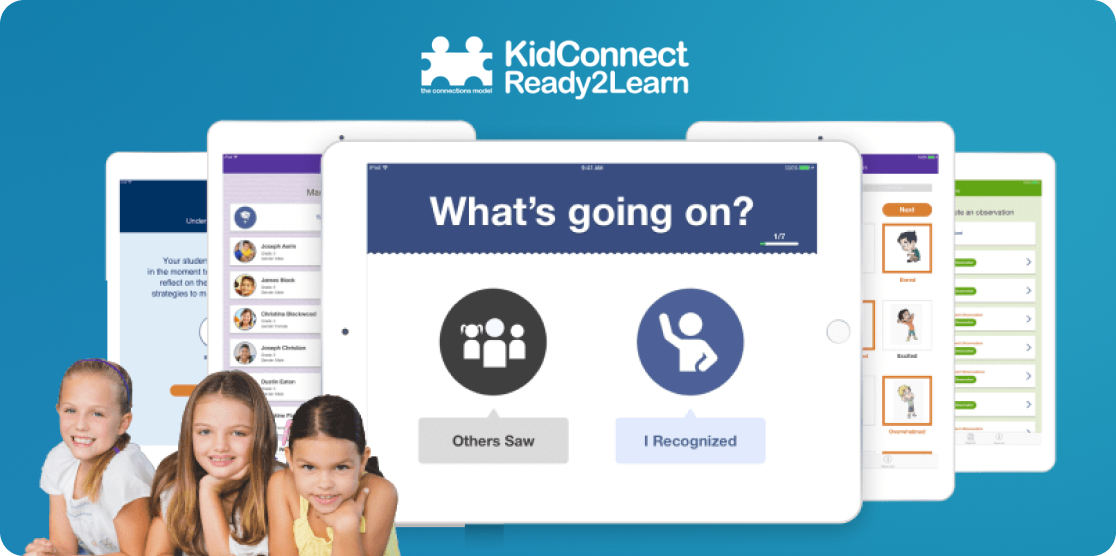
The observation surface is built for speed. An educator notices a child do something — recognise a peer, share a toy, persist through a frustration — and needs to capture that without breaking attention. A prompt-card structure ("What's going on?") lets the educator pick from common developmental contexts, attach a quick note or photo, and stay with the class. The whole capture takes seconds.

The reflection surface lives where the educator goes when the day quiets down. Observations are organised against the connections model — the developmental framework that ties one moment to others — so the educator can see what a child has been building toward, which strengths are showing up consistently, and where the next nudge could land. This is the surface that turns a stack of small moments into a developmental picture.

The family surface translates those observations into plain language and shares them home. Not raw notes, not jargon — moments described in a way a parent can read between school pickup and bedtime, with a clear connection between what the educator saw and what it tells them about their child's development.
—— Design · UI

Calm. Fast. Family-readable.

An educator-facing tool that has to read clearly to a parent at the other end. Three rules ran every UI review.

01

Educator first, child outcome second.

The user we design the surface for is the educator — fast, scannable, useful in a working classroom. The impact we're optimising for is the child's developmental outcome. Both have to be true at the same time, on every screen.

02

No screen between teacher and child.

A teacher capturing an observation should look up from the phone faster than they looked down at it. Heavy forms, long dropdowns, and multi-step flows would put the screen between the educator and the moment — exactly the wrong place.

03

Family copy, not researcher copy.

Anything that reaches a family surface translates the research vocabulary into something a parent can read at the end of a long day. The framework stays underneath the surface; the language on top of it stays plain.

—— What we built

Six surfaces. One companion.

A coordinated set of educator-facing and family-facing surfaces, sitting on top of the connections-model framework that ties them together.

"What's going on?" observation prompts

Prompt-card capture that matches the speed of a working classroom — pick a developmental context, add a quick note or photo, and the observation is logged against the right strand of the framework automatically.

Connections-model framework

The developmental framework underneath the product — strands, milestones, and the relationships between them — wired in so every observation lands in the right place automatically, without the educator carrying the taxonomy.

Classroom roster + student profiles

A roster surface that lives where the educator works — a clean list of students, each with a profile that aggregates observations into a developmental picture without becoming a dashboard the teacher has to maintain.

Family-facing share surface

Observations translated into plain-language summaries a family can read in the space between pickup and bedtime — with the developmental context made clear and the next conversation already shaped.

Reflection + progress view

The educator's quiet-hour surface — observations organised against the framework over time, strengths surfacing on their own, and clear lines into what the next developmental nudge could be.

Identity + permissions layer

Educator, administrator, family — each with the right view of the right child, no more, no less. Built on the kind of identity discipline a product handling early-childhood records has to ship with.

—— The outcome

A product the educator actually opens.

KidConnect Ready2Learn is a mobile-native early-education companion — an observation surface for educators, the connections-model framework underneath, and a family-facing share view that ties the classroom and the home into one loop. Three disciplines we owned: mobile design, child-development UX, and education technology.

01 / What we shipped

A mobile-native education companion.

Observation surface, connections-model framework, roster, family-facing share view, and reflection panel — coordinated across the three disciplines the product required: mobile design, child-development UX, and education technology.

02 / What it carries

Classroom moments, family-readable.

An observation captured in seconds, organised against the connections-model framework, translated into plain language a family can read at the other end. Same loop, three perspectives, one tool.

03 / What we're proud of

An educator-first build.

Most edtech is built without a deep partnership with the people who'll use it on Monday morning. KidConnect was built the other way — the educator's reality first, the framework on top. That's the part the studio is quietly most proud of.

—— More from the studio

Three more apps. Three more outcomes.

If the KidConnect story is the shape of your build — a product for professionals with a downstream user, a framework that has to read both ways, mobile-first surfaces — here's where else the team has shown up.