Download our E-BOOK
Leveraging Cognitive Biases and Errors to Improve Mobile UX
October 27, 2023
by Will Kramer
Introduction
Why does one mobile application succeed when others, with seemingly identical utility, falter? One could argue it’s not just what the application does, but how it engages the end-user that makes all the difference. At the heart of this engagement lies a nuanced understanding of human cognitive biases and errors.
Cognitive biases in the context of User Experience (UX) design can be understood as the psychological tendencies that affect how users interact with an interface, make choices within an app, or even how they perceive the value of a service. These biases can shape the way information is processed and can either help or hinder the goals of a user experience design. Therefore, recognizing and designing around these biases can be crucial for UX professionals.
Understanding cognitive biases allows UX designers to create more effective and engaging interfaces. Whether it’s strategically placing information, simplifying complex tasks, or making recommendations, a well-designed user experience can guide users towards specific behaviors, thereby improving conversion rates, user satisfaction, and overall engagement.
For UX designers, grasping these cognitive biases isn’t just an academic exercise. It directly translates to designing flows, layouts, and interactions that align with how users naturally think, enhancing usability and helping the application achieve its objectives.
All in all, being aware of cognitive biases can offer UX designers invaluable insights into human behavior, enabling them to design products that are not just visually appealing but also intuitively easy to use and understand. This understanding contributes to the overall effectiveness and success of the application or product, making it more aligned with both business objectives and user needs.
In this comprehensive guide, we will dissect 10 common cognitive biases and errors, offering actionable strategies to turn these potential pitfalls into drivers for optimized mobile UX.
1. Paradox of Choice

Choices, choices, choices!
The Issue: In the realm of digital user experience, there exists a counterintuitive phenomenon: presenting users with a vast multitude of options can, surprisingly, leave them immobilized. This paralysis, spurred by an overwhelming array of choices, can stall users in their decision-making process, potentially causing delays or even a complete standstill in conversions.
The Solution: The antidote to this paralysis is simplicity. By streamlining the decision-making landscape and curating options to highlight only those of utmost relevance or benefit, you pave a clearer path for users to navigate.
How to Implement: When designing your mobile app’s landing page, embrace the ethos of minimalism. Rather than bombarding users with a plethora of menu items or actions, concentrate on a select 4-5 pivotal features. This not only declutters the interface but directs users effortlessly to key functionalities. Further refinement can be achieved through astute categorization or segmentation techniques.
By presenting supplementary options in a contextually relevant manner, you ensure that the user’s attention remains anchored to high-value tasks or conversions, diminishing distractions and bolstering the potential for successful user engagement.
2. Anchoring Bias

Hmmm, seems reasonable to me.
The Issue: When confronted with a decision, users often find themselves inadvertently tethered to the initial piece of information they come across. This phenomenon, known as the anchoring bias, means that subsequent data points, no matter how vital, may be overshadowed or even entirely overlooked due to the undue weight given to that first encounter.
The Solution: To harness this, it’s essential to meticulously curate the user’s point of entry. This involves strategically placing the most pivotal or advantageous options squarely in the user’s initial frame of reference, ensuring that this anchor is both compelling and beneficial.
How to Implement: For instance, if you offer multiple subscription tiers, it would be prudent to spotlight the most sought-after or value-rich package right at the outset of the list. By doing so, you instantly captivate the user’s attention, driving them towards the most beneficial choice.
To accentuate these anchor points and guide the user’s perception even further, employ potent visual markers such as “Top Choice,” “Most Popular,” or “Unbeatable Value.” These cues not only solidify the prominence of the anchor but also act as persuasive nudges, steering users towards the desired direction.
3. FOMO (Fear of Missing Out)

Should I? Oh I don’t… Maybe if I…
The Issue: Users are anxious about missing out on exclusive deals or trending topics, making them more likely to take immediate action. This apprehension not only nudges users to stay perpetually plugged in but also makes them more susceptible to taking swift and decisive actions, lest they miss out on something invaluable.
The Solution: Recognizing and leveraging this intrinsic urgency can serve as a potent tool for businesses. By crafting offers or features that are available only for a limited duration, you can tap into this FOMO psychology, compelling users to engage before the window of opportunity narrows.
How to Implement: One of the most effective strategies to bring this The Solution to life is through the judicious use of push notifications or prominently placed banners within the app interface. These notifications act as beacons, drawing attention to these fleeting opportunities. But it’s not just about informing; it’s about invoking action.
The language used should be artfully chosen to amplify the urgency. Phrases like “Grab it before it’s gone!”, “Exclusive 24-hour offer”, or “While supplies last” not only inform but also stir the emotions, prompting users to act posthaste.
4. Confirmation Bias

I knew it! I was right all along!
The Issue: Users, whether consciously or subconsciously, often lean into information that syncs up with their current beliefs or choices. This inclination, known as confirmation bias, can shape their interaction journey in profound ways.
The Solution: In light of confirmation bias, it’s clear that the golden ticket is to enhance user experiences in ways that reflect their existing opinions or choices.
How to Implement: Using state-of-the-art machine learning algorithms and other data analytics tools, we can get a bead on user behavior, mapping out their likes, dislikes, and preferences. With this invaluable data in hand, it’s a straightforward task to shape their digital journey.
Be it through handpicked product suggestions, content that feels like it’s speaking directly to them, or interface elements that seem intuitively familiar. At the end of the day, it’s about ensuring every interaction feels personalized, relevant, and engaging, right from the get-go.
5. Loss Aversion

One more step and its all mine!
The Issue: It seems that the sting of losing something hits roughly twice as hard as the joy of acquiring it. This means users are often propelled to action more by the fear of missing out than the allure of a new gain.
The Solution: By framing our interactions and choices around what users might miss out on, we can tap into this potent psychological force to enhance engagement.
How to Implement: Start by integrating a sense of urgency right into the user interface. Whether it’s a timer ticking down the minutes or a clear indication of limited duration offers, it serves as a visual nudge about potential losses. And when it comes to CTAs, it’s all about the language.
Crafting statements like “Secure Your Spot Now!” or “Only a Few Left – Don’t Miss Out!” not only captures attention but also harnesses the power of loss aversion to encourage swift, decisive user actions
6. Hick’s Law

Oh I see what you mean. Sure, let’s go with this one.
The Issue: As we delve deeper into the dynamics of user behavior, there’s a fundamental principle that consistently surfaces: Hick’s Law. This law suggests that the duration users take to reach a decision is directly proportional to the amount and intricacy of the choices laid before them.
The Solution: At Rocket Farm, we’re big believers in the art of simplicity. Given the insights from Hick’s Law, the roadmap becomes clear: we need to lighten the cognitive burden and pave a more direct path for users to make decisions.
How to Implement: Begin by cutting down on any superfluous steps, especially in critical pathways like the checkout process. A leaner, more intuitive journey translates to faster decision-making. Additionally, consider employing design elements that inherently simplify user interaction.
Single-column layouts, for instance, offer a clear and distraction-free experience. Likewise, using discernible visual hierarchies can effortlessly steer user attention towards the most pivotal aspects, further speeding up their decision-making process. In the world of digital platforms, sometimes, less is indeed more.
7. Cognitive Load

Zzzz…
The Issue: There is one challenge that consistently emerges: the impact of cognitive load. When users are bombarded with a barrage of information or a plethora of options, their working memory takes a hit. The result? Cognitive fatigue and, often, a complete halt in the decision-making process.
The Solution: Our mantra is clear: user-friendliness is key. Given the pitfalls of cognitive overload, the directive is to break down information and tasks into bite-sized, easily digestible segments, ensuring a seamless experience.
How to Implement: The answer lies in progressive disclosure. Instead of overwhelming users with a tidal wave of information right out of the gate, present only the essentials upfront. Then, as the user navigates, grant them the ability to delve deeper when they desire.
Tools like tabs or expandable sections can be invaluable in this approach, revealing supplementary details only when the user opts in. By managing the flow of information in this manner, we ensure that users remain in the driver’s seat, engaging with content at their own pace and on their own terms.
8. Reciprocity Bias

That looks about right, go ahead and add that to cart.
The Issue: It’s a simple yet powerful notion. When users are presented with something valuable, an intrinsic drive often compels them to reciprocate the gesture in some manner.
The Solution: At Rocket Farm, we’ve always championed the idea of giving before getting. With the reciprocity bias in play, the strategy becomes evident: kickstart the engagement cycle by leading with valuable offerings, all without immediately seeking anything in return.
How to Implement: So, how do we bring this concept to fruition? It could be as straightforward as offering a one-month free trial, letting users immerse themselves in the full spectrum of what’s available. Alternatively, consider delivering exclusive content — think along the lines of in-depth e-books, insightful tutorials, or even masterclasses.
By laying out these value-packed propositions upfront, we’re not just making a statement about the quality on offer but also setting the stage for users to reciprocate, be it through subscriptions, referrals, or extended engagement.
9. Social Proof

See! We told you! Do it! Do it!
The Issue: One truth consistently surfaces: people are inherently swayed by the decisions, attitudes, and endorsements of their peers.
The Solution: We believe in the age-old adage that seeing is believing. With social proof in the equation, it’s clear that spotlighting how others are leveraging your app can spark similar engagement from new or undecided users.
How to Implement: Whether it’s glowing customer testimonials, stellar ratings, or impressive download counts, strategically embedding these endorsements at pivotal points within the app can bolster trust. Not only does this showcase the value your app delivers to its user base, but it also serves as a subtle nudge, urging users to hop on board and partake in the shared experience.
10. Sunk Cost Fallacy

Grrrr! Fine, fine, fine…
The Issue: The essence is simple yet profound: when users channel their resources into an endeavor, their commitment to seeing it through amplifies — sometimes even when logic might suggest otherwise.
The Solution: With the sunk cost fallacy at play, the path forward is evident: craft scenarios where users can make incremental initial investments, laying the groundwork for heightened, sustained engagement.
How to Implement: The secret sauce might just be gamification. By introducing elements that reward those first steps — think bonus points for fleshing out a user profile or accolades for accomplishing starter tasks — we’re not only acknowledging their investment but also building a foundation of commitment.
It’s this initial interaction, however small, that can propel users to stick around, driven by the underlying urge to capitalize on their initial investment and immerse deeper into the app experience.
Final Thoughts
By acknowledging these inherent psychological tendencies, we can proactively design The Solutions that not only cater to the user’s needs but also enrich their experience, making the application more intuitive, user-friendly, and ultimately more successful.
The goal is not to manipulate but to facilitate. We aim to simplify the user’s journey, helping them make informed decisions more effortlessly. Whether it’s by reducing cognitive load, leveraging social proof, or offering initial value to kickstart a reciprocal relationship, these strategies are all geared towards one outcome: enhancing the user’s ability to make choices that they are comfortable and happy with.
When users navigate through your app, the greatest testament to your UX design’s effectiveness is not just in metrics of higher engagement or increased sales, but in the genuine sentiment, “This feels right.”.
This is a powerful affirmation that not only resonates on a superficial level but speaks to an experience that aligns seamlessly with human psychology. Such a sentiment indicates that the application understands them, making interactions not just transactions but meaningful engagements.
In a market where user expectations are perpetually evolving, Rocket Farm Studios provides the innovative, user-centric The Solutions that are essential for staying ahead of the curve. Partner with us to navigate the complex realm of mobile UX design and transform the way your users interact with your digital assets.
Because at Rocket Farm Studios, we make sure that technology feels right to those who use it.
Related Blog & Posts


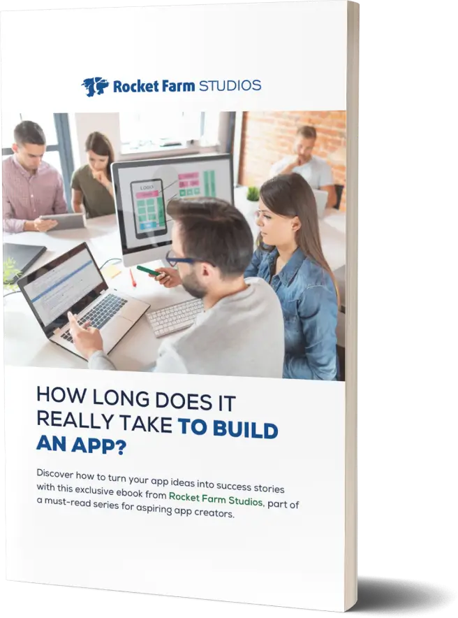
How Long Does It Take to Build an App?
Explore the key factors influencing app development timelines in this insightful guide from Rocket Farm Studios.
Download E-Book
Ready to turn your app idea into a market leader? Partner with Rocket Farm Studios and start your journey from MVP to lasting impact.”
Related Blogs
Download Our Free E-Book
Whether you’re launching a new venture or scaling an established product, Rocket Farm Studios is here to turn your vision into reality. Let’s create something extraordinary together. Contact us to learn how we can help you achieve your goals.