3 Signs of Life for Windows Mobile

February 25, 2015
 
Ashley Rondeau

These days, it seems like the mobile environment is a two horse race between Apple’s iOS and Google’s Android OS. Gone are the days of BlackBerry OS holding much market share, or HP’s WebOS that tried to extend Palm’s attempt at a mobile operating system contender. And today’s upstarts such as Samsung’s Tizen and Mozilla’s Firefox OS have yet to make much of a splash. Is there no hope for a third mobile OS with a sizable piece of the pie?

There is a small glimmer of hope: Microsoft’s Windows Mobile is clinging to a 2.7% market share at the end of 2014. To be clear, this is down from 3.3% in 2013 so Microsoft executives aren’t exactly jumping for joy, but there are new signs of life that show that they aren’t about to throw in the towel just yet.


Source: DigitalTrends

1. Windows 10 was built with mobile even more at the forefront.


Recently, Microsoft gave a technical preview of the upcoming Windows 10 operating system, which basically iterated and improved upon all the successful mobile points in Windows 8.1. The user interface is slicker, speech recognition is better, and there are many more avenues for customization which is sorely lacking on current Windows phones. For example, you can finally change your background image.


This is good news. Sure, changing background images is a fairly minor feature but it shows that Microsoft is trying to appeal to the average user who just want a picture of their cat on their phone. Windows 10 will hopefully put usability first, and any updates to the operating system will be greatly appreciated by disgruntled fans.


Microsoft Office for Android Tablet Outlook Word ExcelSource: Microsoft

2. Microsoft is sharing Office apps with Apple, Android, and more.


In the past year, Microsoft Word, Excel, and Powerpoint have been joined by Outlook, OneNote, and OneDrive apps on more Apple and Android phones. Not only that, Microsoft has opened up their apps to integrate with 3rd parties such as Box and Dropbox. Many have applauded this “new level of openness” from the company historically stingy with technology.


This move certainly has an air of “if you can’t beat ‘em, join ‘em,” to it, but it also shows a commitment to inserting Windows into the mobile conversation. MS Office is still ubiquitous and it’s a smart move to leverage this software to keep a foothold with the consumer. Not only do these apps provide a stream of revenue for continued mobile efforts, getting users hooked on your apps can lead to hardware sales. After all, many choose Android phones due to their love of Google Drive apps (Docs, Sheets, Maps), something Microsoft if very aware of.


3. Microsoft knows it has an app problem and is working on it.


Ask any Windows Phone user what their number one complaint is and you’ll probably get the same response each time: “there just aren’t enough good apps in the app store.” Though Microsoft has stated that the Windows Phone Store has over 500,000 apps, that number is still dwarfed by both Apple and Android boasting over a million. And that’s not even weeding out apps that simply don’t perform as well for Windows phones.


Luckily, executives at Microsoft are actively courting app developers to create more apps for their ecosystem. Recent reports show that outreach teams at Microsoft have been tasked with finding talent from startups, established companies, and students. Hiring is always a good sign that a company is taking something seriously, and we’re eager to see what new apps will arrive in the Windows Phone Store in the coming year.


At this point, it’s hard to imagine Windows Phone becoming relevant again as their market share continues to decline. But these positive signs show that Microsoft isn’t giving up any time soon, and mobile competition is always great news for mobile consumers. For now, we won’t be counting Windows Mobile down for the count.

For more insights into the mobile app industry, follow our Twitter,FacebookLinkedIn or RSS feeds.

So, if you don’t know where to get started with a blueprint for your app, Rocket Farm Studios can take the pressure off.

5 Reasons Why App Developers Still Choose Apple Before Android

February 17, 2015
 
Ashley Rondeau

Time.com declared the smartphone app war over and touted Apple as the winner. While we are not so bold, it’s clear that as of early 2015 Android is still playing catch up to Apple in terms of luring app developers to build for it first. In a perfect world (well, for developers), it would be easy to build simultaneously, but the nuances of both ecosystems keep cross-platform builds a daunting task.
So they pick Apple first, and they’re not wrong. Here are a few reasons why:

1. Android fragmentation is still an issue.

We’ll be the first to admit that the fragmentation issue is overblown. Since the dawn of Android 4.0 and higher, many of the woes developers faced building for the various android devices have gone away, and screen sizes for the most popular devices have somewhat stabilized.
At a recent tech conference, app developer Russell Ivanovic (Pocket Casts) took the stage to explain how “standardized screen resolutions for Android have taken much of the guesswork out of how his app will look and behave on various devices.” Sure there are some variations, he said, but it’s not that hard.
Of course, the tech conference in question was a Google I/O event.
Meanwhile, the August 2014 Android fragmentation report from OpenSignal still shows a daunting amount of devices on the market:
Android Fragmentation Report August 2014 OpenSignalOpenSignal
Even developing for Samsung alone, which has 43% of the Android market, means dealing with a wide range of devices in terms of screen size, RAM, versions of Android, and other specs. Compared to this, the Apple ecosystem of devices seems downright simple, though the arrival of larger screens in the iPhone 6 and 6+ have added some fragmentation. Still, developers know that it’s just easier to build an app for Apple products due to this issue.

2. Less time debugging, more time actually coding.

Ask any developer what she likes to do more: code or chase down bugs. Naturally a coder wants to code. In a recent report, the majority of Apple developers said they spent most of their time coding, while the majority of Android developers spent their time testing and debugging.
With the amount of devices to test your app on (see point #1 above), it’s no wonder this is the case. It’s like asking whether a chef wants to spend all his time cooking or making sure his customers don’t get sick.
Furthermore, compared to iOS, the tools developers have access to are not as good and the API is more difficult to work work. Apple’s guidelines and UIkit are just slicker to use, so much so that some developers feel building and releasing on Android costs 2-3 times more than iOS.

3. Surprise! The Android app marketplace is more crowded.

It seems like just yesterday that Android was struggling to match the number of apps on Apple’s App Store. Well, it was but not anymore. Just in the past year, Android overtook Apple in this regard:active_apps_2 (1)

AppFigures

And though different app categories have different levels of saturation, it’s clear that moving forward launching an app for Android will be met with increasing competition. This growth is due to a number of factors, but a major one is that Android overall has a lower bar for app quality. Simply put, Google Play and other Android app stores allow far more crappy apps (let’s call them crapps) to permeate their ecosystem than Apple allows. Developers who believe in releasing high quality apps still turn to Apple first.

4. Security is a major issue in Android.

With seemingly a new major security breach every other week these days, consumers are becoming more savvy discerning when software might be more trouble than its worth. Unfortunately, Android’s security problem is getting worse, not better.
In 2012, a report showed 79% of all malware infecting mobile phones were on an Android device. This was up from 66.7% in 2011. In 2014? A new report showed that 99% of infected devices ran Android. Ouch.
Android’s open ecosystem makes it much easier for black hats to attack the OS, and this doesn’t seem like an issue Google is taking seriously enough, especially in light of customers demanding more and more security and privacy. Meanwhile, Apple’s side of the fence looks positively spotless as their tight ecosystem, while somewhat restrictive, keeps users safe from malware.
Patching vulnerability after vulnerability and dealing with the headaches of viruses are problems developers hate to deal with, especially for smaller teams who simply don’t have the bandwidth to maintain such vigilance. Why contend with the issue when developing for iOS avoids it altogether?

5. Apple is still where the money is.

At the end of the day, it all comes down to the almighty dollar. Sure, Android has the attention of the developing world. Some reports show over 84% of global mobile users have Android devices (Q3, 2014), and this number is poised to grow as more and more budget Android devices reach market. However, the market for app purchases in the developing world is only a fraction of what it is in the US, and most app purchasers in the US are with Apple.
Even with under 15% of the smartphone user share, Apple’s iOS ecosystem generates a whopping 85% more revenue for developers than Android, a number that simply can’t be ignored if you’re in the business of staying in business.
It’s not noble. It’s not pretty. In fact, it’s a downright unnerving look into the socioeconomic divide between the haves and have-nots, as BusinessInsider so clearly mapped out for us:
Android Is For Poor People Maps Business Insider

BusinessInsider

The affluent use iPhones, and the people who use iPhones buy many more apps and in-app purchases than those that own Android devices. From the TheCheatSheet article linked to earlier, “Apple has already achieved 98 percent iOS penetration with Fortune 500 companies and 92 percent with Global 500 companies.” You just can’t ignore those numbers.
It’s as simple as that, and it’s by far the most compelling case as to why developers still put Apple first.

The future

So, in light of that last haymaker, is Android destined to be an also-ran in the hearts and minds of app developers? In the short term, it’s hard to argue against the facts: apps for Apple still make the most sense. But the future is wide open, especially if both Google and young developers can work together to make Android a more friendly ecosystem to build in. Android definitely isn’t going anywhere and their numbers are growing around the world, and that is a future that app developers won’t be able to ignore.
For more insights into the mobile app industry, follow our Twitter,FacebookLinkedIn or RSS feeds.

So, if you don’t know where to get started with a blueprint for your app, Rocket Farm Studios can take the pressure off.

How do I love thee? Let me count the Waze.

February 13, 2015
 
Dan Katcher

In the spirit of Valentine’s Day, we pen a love letter to one of our favorite apps.
There are not a lot of apps that out there that evoke true emotion in their users.  How often do you speak to an app?  Yell at an app?  Thank an app?  I’ll confess – I’ve developed a decidedly human relationship with Waze, and I know a growing number of people who have as well.
Waze is such a thoughtfully designed app and a thoughtfully designed business model.  It’s also an incredible social experiment that it’s worth studying the crap out of it and to learn what it does so well (and a little of what it doesn’t do well). Let’s take an in-depth look into why this app was so successful that Google had to snatch it up for $1.3 billion dollars.

Design in Detail

The first thing to think about when consider design is the context of the user utilizing the app.  Waze takes on one of the most complex contexts: driving.  To be a companion to the driver is an immense challenge.  And lots of companies, including Google in their original Maps program and Apple as well with their Maps, have not done it well.  Waze does it well.
Everything in Waze is geared around helping you drive.  It’s not just navigation, though navigation is central.  It’s about finding you the most expedient route home, while reacting to a continually changing environment.  Driving is complex, and that context dictates a lot of design choices, as we’ll see below.

1. On-boarding

Each screen of Waze’s on-boarding introduction is simple, and necessary.  Each step captures the minimum of information with clearly designed instructions.  Four steps and you’re looking at your location on a map.  Choose navigate the first time and there’s an obvious opportunity to add in a home and work address, or simply search for an address.  Navigating is simple – choose home, work or type in your destination and Waze calculates a route based on current traffic conditions.  “Ready?  Let’s Go”.   Waze’s audio voice is encouraging as if signaling the start of an adventure.

2. Awareness

The thoughtfulness of Waze’s complementary driving experience continues.  The display flips from light to dark at night automatically.  If you pan around the map at a red light, navigation will resume automatically when the app senses you are moving.  You can zoom around the map to search for things, but it naturally resumes navigation when you have resumed driving. Audio controls are carefully integrated with the experience as well.  A very distinctive tone comes up when the app is re-routing because of traffic.  Chimes herald an adjustment in ETA, whether a gain or sometimes sadly, a delay.

IMG_6165

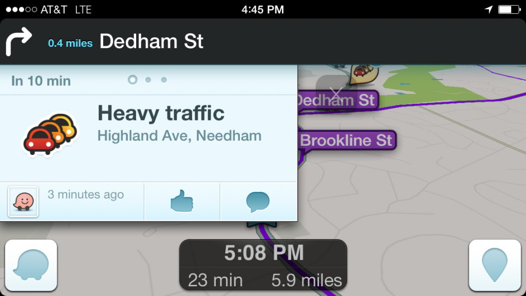
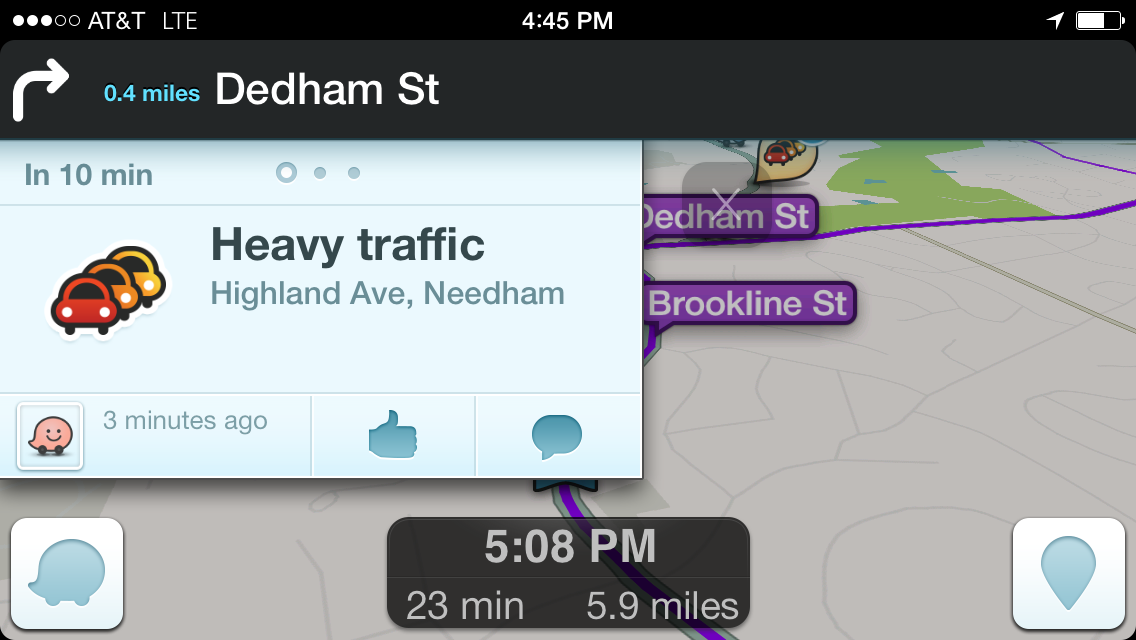
3. Real-time connectivity

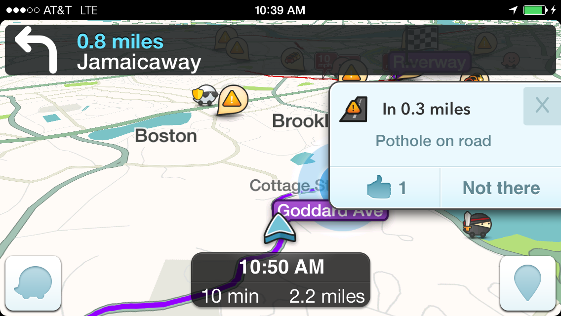
Intuitive design continues throughout the experience.  A dialog will pop up asking you to confirm a hazard in the road ahead.  The dialog updates in real-time with the distant to the hazard.  The buttons are simple and minimal: Thumbs up confirms that the hazard is still there, with the helpful additional information of how many Wazers have confirmed the issue.  Not anymore confirms that the hazard is gone.  The dialog will remove itself once you are past the reported location itself.  Other dialogs – such as when starting a route or when reporting a hazard – also automatically submit themselves with a helpful countdown in seconds of how much time is left before the dialog goes away.  All incredibly helpful when you should be focused on driving.

4. Personalization

Waze learns from you as well.  In the mornings it asks if you are going to work.  In the evenings, Waze is ready to take you home.  It knows the cheapest gas station on your route too, in case you need to top off. Again, the attention to detail is singularly focused on helping you drive while clearing out clutter and minimizing actions that you must take to be a great driver.

The Social Experience

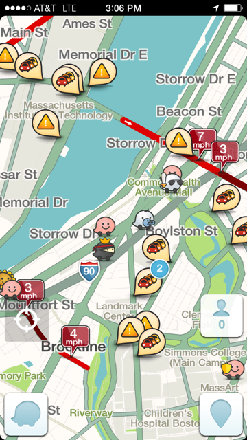
Design elements of the individual experience are one thing.  What is also great about Waze is how it incorporates the social experience into everyday driving.  Even if you don’t use Waze to directly connect with your driving buddies (which in itself is an incredibly useful tool), you are reminded from the outset of all the other Wazers there in the area around you (usually thousands) and how many reports have been filed (usually hundreds).    Everyone gets a cute (yes, cute) little car representing the true you.  You can customize your car if you choose in a way that speaks to you, as well as choose a fun name for yourself.  You see Wazers driving all around you.

5. Community

IMG_6161
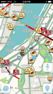
But these cute little cars are not just gimmicky.  They go to reinforce the incredible social experience and crowd sourcing capabilities of Waze.  Without all this input from other Wazers,  Waze would not be nearly as powerful as it is today.  And it reinforces the emotional draw into the experience.  I’m just like all those other Wazers, driving my car around and doing my best to contribute to the knowledge of where hazards lie, all for fun and the greater good of the community.  There’s something very comforting about seeing other Wazers on the road.  You feel a connection even though the relationships are largely anonymous.
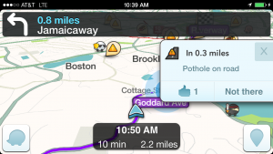
6. Call to action

Waze does a nice job of helping people to contribute.  The dialogs are simple for adding a hazard, and thoughtful in how they require a minimum of steps to report a hazard in the road (which side, what type, etc.)  Again, the dialogs will send automatically to minimize the button presses by a user.  And it’s the combination of real-time reports from other Wazers, coupled with real-time data that Waze gathers from the app itself (average speeds on a segment of the road way for example), which makes the app so incredibly useful.

7. The end goal

And this is where it gets interesting.  Using all this information, Waze does an amazing job back on its servers of knowing where you are going and routing you there most efficiently.  Waze will actively pick routes and change them based on current real-time traffic conditions.  Mass Pike backed up again in the morning?  Follow Waze onto a previously unknown route through Cleveland Circle to the Pike entrance near Cambridge St.  Drive home is slow?  Looks like Waze is taking me alongside the Pike and then through Brighton.  I didn’t know you could go that way.
If you trust Waze (which is mostly a good idea) it will help you find routes you never knew existed.  And it will save you time.   When the construction started on the Pike by the Pru, my commute time shot up to almost an hour (from what should be a quick 30 min drive).  Since Wazing, it now consistently, even on the worst traffic days, finds me a route that is usually around 40 minutes.  And the impact on larger drives is even better.  The trip down to Grandma’s house in NJ used to take 4:40 and take us over the Tappenzee.  With Waze, our last trip back was just over 4 hrs – an incredible savings of time and gas.   And when trouble strikes – as it did when I-278 in NJ was closed on the last journey because of an accident – Waze is quick to re-route you, sometimes through quiet neighborhoods, past the trouble.  Of course it’s not all roses when local residents get up in arms about the Waze effect, but that’s part of the magic of the model – it’s the democratization of local driver knowledge, preciously held by the few, into the hands of Wazers everywhere.

8. The Business

So the experience is fab.  But Google is not a charity.  They are running a business here and Waze incorporates ads into the experience in some subtle waze.  Ads take two forms.  Popups show up at red lights and stop signs, and go away again quickly when you start again.  And then there are sponsorships: who wouldn’t want to know where the nearest Dunky is as you sit in traffic because the T is shut down by snow again.  You can easily put your own ads up for all the Wazers to see.  Will it be a big part of Google’s business?  Most definitely – Google will happily pay a lot of money for an app that serves ads to a lot of people and that you rely on for sometimes hours a day.

The Social Benefit – Smart Highways are Here

9. The Future is Here

Did anyone notice that the future of “Smart Highways,” a term often discussed and frequently funded by state and national governments, is now here.  Study after study (See Brookings Institute report, MIT Technology Review, Popular Mechanics) from the past 15 years have speculated over the kind of investment and the types of technology required to build Smart Highways that would sense accidents and incidents, traffic patterns and speed, and intelligently reroute commuters to minimize drive time.  Those reports largely focus on public investment, and envision a largely government-run infrastructure required to support the concepts.
So with Waze’s arrival, Smart Highways have happened almost instantly.  The concepts of intelligent re-routing and incident notification are here, in force, with Waze.  And it didn’t require anywhere near the billions and billions of public investment that was imagined.  In fact it cost about $1.3 billion.  And did anyone else notice that this Smart Highway system known as Waze is also global?  And it’s privately owned by the folks at Google.  Interesting! (And maybe a tiny bit ominous).
IMG_6160

10. The Conclusion

Is Waze always perfect? No, even Waze has it missteps, like the misguided winter scavenger hunt it ran.  Whoever decided that cluttering up the screen and adding snowflakes and snowmen in a ‘game’ that distracts drivers in a driving app is not making a good decision.  And this winter in particular, I am sick of seeing pop-ups from reports of potholes.  Yes I know there are friggin potholes everywhere, and I don’t need to keep dismissing the warnings.
But no relationship is perfect, and there are times when I end up yelling at Waze. But I fell in love with this app for a reason, and like any good relationship, I know that we’ll work through it. Especially since I know Waze will get constant updates so I won’t have to change. Happy Valentine’s Day, Waze.
For more electronic love letters and insights into the mobile app industry, follow our Twitter, Facebook, LinkedIn or RSS feeds.


So, if you don’t know where to get started with a blueprint for your app, Rocket Farm Studios can take the pressure off.

Apple Watch Apps: 3 Design Challenges

February 4, 2015
 
Ashley Rondeau

The Apple Watch is set to launch this April and there have already been plenty of sightings of this anticipated wearable out in the wild, and plenty of third parties have downloaded the WatchKit SDK to start creating apps. While we’re excited about the possibilities of this new device, smart watches have been, well, they’ve been mostly misses so far and the apps that come included are often to blame.
If your company is thinking about adding a third party app to the Apple Watch roster, what the factors should you be aware of so your app isn’t a lemon? Here are three design challenges that we see on the horizon.

1. Design for limited battery life.

photo credit: Flickr
When’s the last time you changed out the battery on your regular wrist watch? A year ago? Three years? For “dumbwatches” (we guess we’d have to call them now), battery life is basically a non-issue. That can’t be said for the Apple Watch, which reportedly has a similar battery life of other smartwatches on the marked today: about 19 hours of active and passive use (2 to 4 hours active). Barely enough for a full day’s use.

Apps will need to be fairly bare-bones to avoid being the major culprit of a dead battery, so your company will need to design with minimal drain in mind. How often will it push notifications onto the screen? How often will it access the Bluetooth connection to the iPhone for GPS and other information? Will your app disable any background activity when battery life is low? Consumers are getting savvier about finding and removing apps that drain battery life. Don’t let your app be the one that gets sacrificed to the lithium gods.

2. Design for a really tiny screen.

Apple Apple Watch Design
photo credit: Apple
The screen size of the new iPhone 6 is 750 x 1334 pixels (4.7 inch diagonal). The Apple Watch is 312 x 390 pixels for the larger screen and 272 x 340 pixels for the smaller screen. Apple knows it’s a small screen, which is the reason it doesn’t even list the diagonal measurement (1.5 and 1.32 inches, respectively) on the website. You expected it, but now you’re thinking about designing an app for it.

Everything old is new again. Great apps on a smartphone will have to be completely rethought to work on a much smaller display. For example, one company that created an app for another smartwatch designed its app to display overlapping, translucent info with the primary information emphasized. This is a novel approach and companies will need to devise new methods of displaying information to succeed on the Apple Watch.
It’s not just a matter of displaying either; it’s also interacting with the small screen. The Apple Watch provides a physical dial, sure, but which actions should be a tap or a swipe on the screen instead of fumbling with the dial? How much control should be available on the watch app versus the phone app, which it will be tethered to? It’s a good idea to do your homework on what others have conceived to see what might work as you build.

3. Design with “glanceability” in mind.

Nothing’s going to kill your app faster than users having to squint to see what it’s trying to tell them. The beauty of a dumbwatch is that it takes a split second glance to get the info you need. How can you simulate that experience even while providing a more complex service?

It comes down to taking a scalpel to the information you can display and culling it down to the information you should display at this moment in time. Contextual relevance will be the key to glanceability.
Todoist has offered a preview of their task managing app on the Apple Watch, and to be quite honest, it still looks awfully busy on that little screen. Showing even more than one task at a time for a watch (when the full task list is available on your phone in your back pocket) seems like overkill. We’re also hoping the app takes GPS in consideration so location-specific tasks can pop up when contextually appropriate.

At this point in the game, glanceability has to outweigh features because it provides the best user experience, and the singular way you’ll sell them on your Apple Watch app. Once you earn their loyalty, you can give the user the option to add more information as he or she sees fit, but it is prudent to err on the side of glanceability to start.
For more insights into mobile app design, subscribe to Rocket Farm’s RSS feed.

So, if you don’t know where to get started with a blueprint for your app, Rocket Farm Studios can take the pressure off.

7 Super Bowl ads that prove we are in the mobile age

February 2, 2015
 
Dan Katcher

That was some game, huh? And if you weren’t too busy alternating between paralyzed pillow-gripping and near cardiac arrest, perhaps you noticed that there were a few ads sprinkled in amongst the passes, hits, and [blessed] interceptions.
Alongside the ads about fatherhood and puppies, we were gratified to see many of the spots pointing to a truth we here at Rocket Farm have been embracing for a while: Mobile is here to stay. Super Bowl ads are not known for their edginess; they are traditionally aimed at the most median consumer marketers can conceive. So to see cell providers, online games, and mobile devices play such a seamless and prominent role in this year’s spots makes it pretty clear that mobile isn’t going anywhere.
Here are our seven favorites:
7. Wix.com – Favre and Carve

Sure, this one’s about websites in general, but the product shots throughout the spot make it clear that Wix.com knows it needs to make sites that look great on devices of many shapes and sizes.
6. Nationwide – Invisible Mindy Kaling

It’s not until the punchline – involving an awkward encounter with Matt Damon – that this fanciful ad touches on mobile, but Mindy’s insistence on grabbing a selfie with the actor highlights the thorough integration of multi-function phones into everyday lives.
5. Coca Cola – Make It Happy

Coke probably doesn’t actually have the power to end online bullying, but this ad makes it clear that our phones and tablets hold an intimate, emotionally connected place in our lives. (McDonald’s pushed this button as well.)
4. Mophie – All Powerless

It sure feels like the end of the world when my phone runs out of power; this ad imagines – in quirky and creative detail – the global effects that would ensue if God’s phone needed charging, positioning smartphones as necessities rather than optional luxuries.
3. T-Mobile – Save the Data

We assume you are doing more with your data than perusing Kim K.’s sartorial choices, but the most famous Kardashian’s self-satirical spot does get at the reality of modern phone use: Data reigns supreme and talk time is of secondary (or perhaps even tertiary) concern.
2. Clash of Clans – Revenge

Mobile gaming hits the big time, and Liam Neeson turns in a performance that falls just on the right side of the line between funny and downright frightening.
1. Doritos – When Pigs Fly

What did this ad have to do with mobile? Nothing. And we’re not saying that this whimsical spot by Doritos was inspired by a certain pioneering, mobile-oriented Rocket Pig we all know and love. But we’re not denying it either…

So, if you don’t know where to get started with a blueprint for your app, Rocket Farm Studios can take the pressure off.