So after countless nights of pizza and Jolt cola, you just finished coding the next great iPhone app. Time to sit back and watch the money start pouring in, right? After all, some guy made iFart
and made almost half a million dollars. Of course, getting noticed on the app store isn’t quite as easy as it used to be back in 2007.
Today, launching the app is just phase one of what you need to do to ensure your app’s success and see the volume of downloads you’re looking for. The next phase is taking steps to make sure your app has the best visibility on the Apple App Store as possible. Here are five tactics to help you climb the ranks and grow your user base.
1. Optimize your app page for search.
There are many factors to consider when optimizing for the App Store’s search engine, but it all starts with the title/name of your app and the app description. Ideally, your app’s name should also include the main keyword you’d want it to show up for in search. If that’s not realistic, make sure you craft your app’s title carefully to include keywords with the heaviest search traffic. Do your research, because it’s not a great idea to change your title once it starts getting traction.
Next, make sure your app description front-loads relevant keywords and accolades in the first 2-3 sentences since only the first few sentences display in summaries and before the user expands for more content. See what keywords your competition uses as a clue to what’s popular. The description can change as your app hits new benchmarks or earns awards, so keep it up-to-date with the latest and greatest.
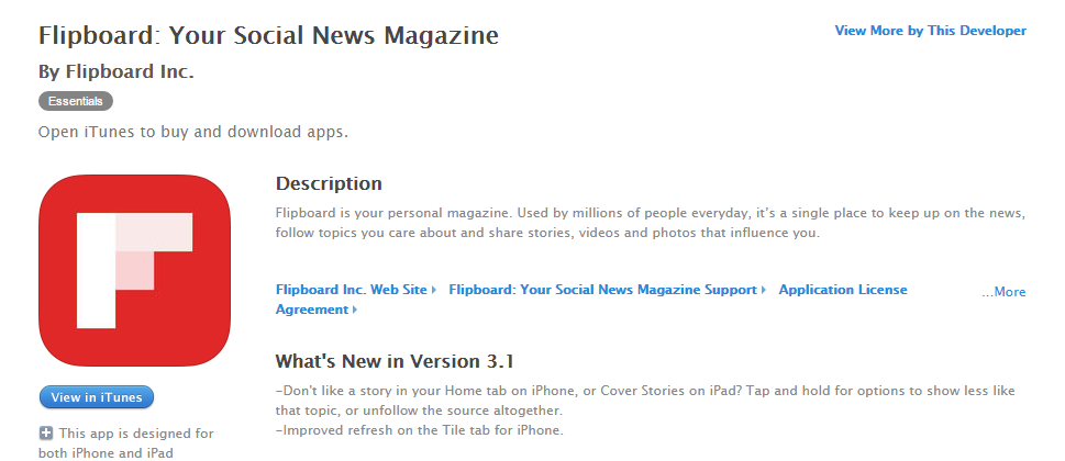
Flipboard is a great example of an app with good title and description. They tout use by “millions of people” in the second line, which is designed to let browsers know that it’s a trusted and popular app.
2. Optimize your app page for the user.
Your app’s page on the App Store is your little piece of virtual real estate to convert browsers into users, and it’s not something you can get by with simply doing the bare minimum. Once users land there, you have only a few seconds to gain their trust so your page needs to do this immediately.
One of the biggest factors, both literally and metaphorically, are the screenshots of your app you choose to upload. Now that users can compare screenshots of different apps from the search page of the App Store, keep in mind that you’re not just showing off your app; you’re also directly competing with similar apps.
Let’s compare the first featured image of two different workout apps:
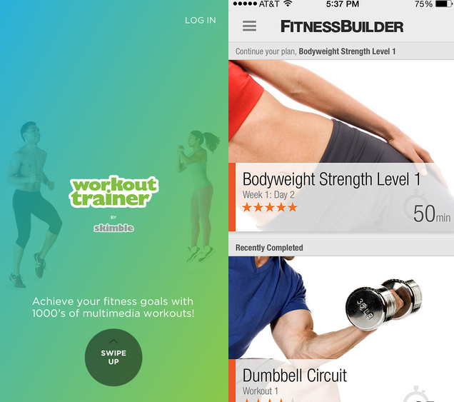
The one on the left doesn’t tell the user much except that there are “1000’s of multimedia workouts” while the one on the right packs in a lot more information: there are training levels, the length of a workout, a star rating system, the ability to mark a workout as completed. The second app’s first screenshot simply tells the user more relevant information and should lead to a higher conversion rate. (Find more tips on screenshots here)
While the iOS Developer Library is a great resource to get you the technical specs you need, you’ll get more from looking at the pages of established and popular apps. See how they use their five allotted screenshots, how they write their descriptions, and how they earn user trust. Then track performance, test different combinations of images and text, and continue to optimize your app page every couple months.
3. Collect good reviews, avoid bad ones.
Aside from the number of downloads, which is the point of this blog post, the number and quality of your reviews are important to showing up higher on the Apple App Store. Sure, you’ll do the obvious things like begging every family member, friend, colleague, and stray hobo to write you five star reviews, but there’s more to be done.
For example, consider building a way for dissatisfied users to provide you feedback that isn’t simply by leaving a bad review. Adding on something like Instabug allows users to report bugs and feedback without compromising your App Store ratings; and Review Bar is another clever way to engage your happy users while dealing with your unhappy ones before they leave negative feedback. Or at the very least, include a clear support@ email in your app description to mitigate a slew of unhappy reviews. This way, you can selectively remind users on your own schedule to submit positive feedback apart from their complaints.
Since things will start snowballing as your app garners good reviews, eventually your hard work will get your app reviews to a self-sustaining critical mass.
4. Get on a featured apps list with a concerted effort of “buzz.”
Your app appearing on the top charts can be a huge boon for the number of downloads you see, but it’s a Catch-22 right? You already need a ton of downloads to get featured. Well yes, but it’s something you can make happen if you are willing to put in the effort of generating buzz in a short amount of time.
According to trademob.com, the algorithms that pull apps into the top charts heavily weigh the volume of downloads in your target country in the preceding three days, with the last 24 hours being the most important. Knowing this, there are a variety of ways to boost the number of downloads in this very specific window of time:
- Time a press release, blog, or other piece of content to hit news outlets.
- Buy ads, placements, or affiliate marketing buys.
- Employ an agency to boost your app’s visibility./li>
If you have a marketing budget, this sort of concentrated marketing blast can push your app into the top lists, which can then snowball into a slew of continuing downloads.
5. Make an app people love, again and again.
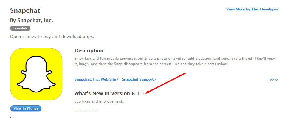
Snapchat hit it out of the park nearly upon its initial release as “Picaboo” back in 2011. It was an app that people loved and it went viral quickly, and a huge part of its success came from listening to and catering to its member base.
As the image points out, a simple app that facilitates impermanent pictures is now on version eight, even though the core product hasn’t changed much. This illustrates the best way for your app to succeed: make it great, over and over again. Listen to your users’ feedback, address their concerns, be quick to fix bugs, release updates and don’t skimp on technical support.
After all, word of mouth is the second most important way users find apps after search, so retaining your user base is as much a marketing tool for new users as it is anything else. Also, factors such as average frequency of app usage, the discard rate, and app freshness (new features, versions) are all thought to be included in the algorithm for App Store ranking. Thus, app iteration is akin to app success.
For more insights into mobile app development, marketing and other insights, be sure tobookmark the Rocket Farm Studios blog!


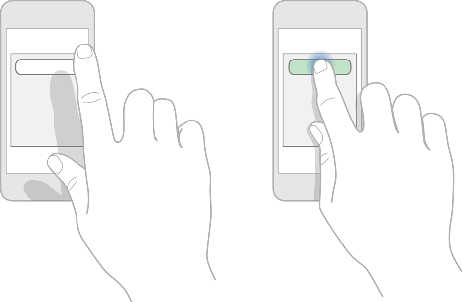 When one pushes a button in the real world (or IRL, as it’s known these days), he or she feels the button’s shape and can feel the button depress. In lieu of this tactile response, app designers should include visual feedback to let users know when their taps have registered. Unfortunately, this design element is often missing.